---
title: Figma
description: Turn a Figma file into a working app.
product: v0
type: integration
prerequisites:
- /docs/quickstart
related:
- /docs/design-mode
- /docs/screenshots
---
# Figma
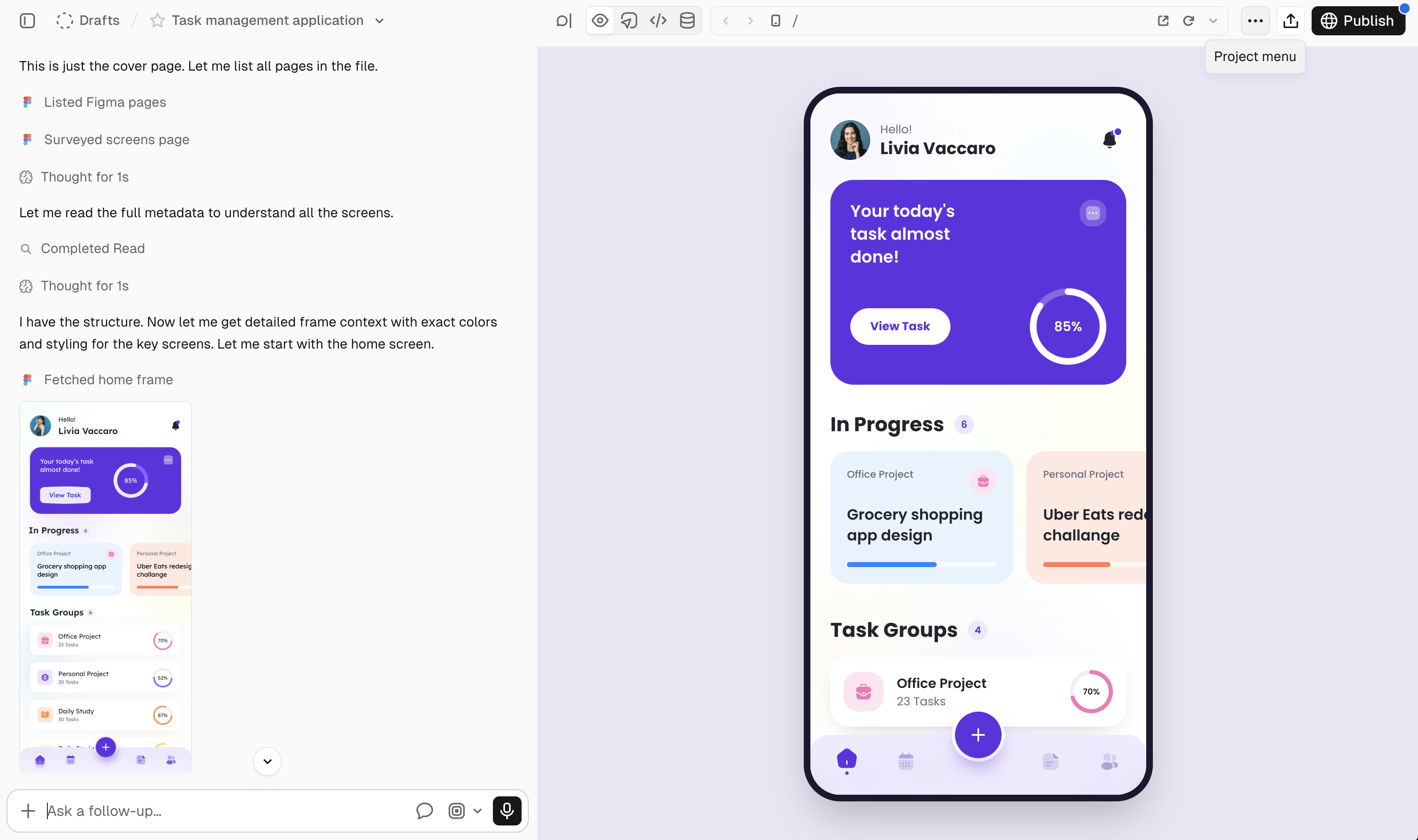
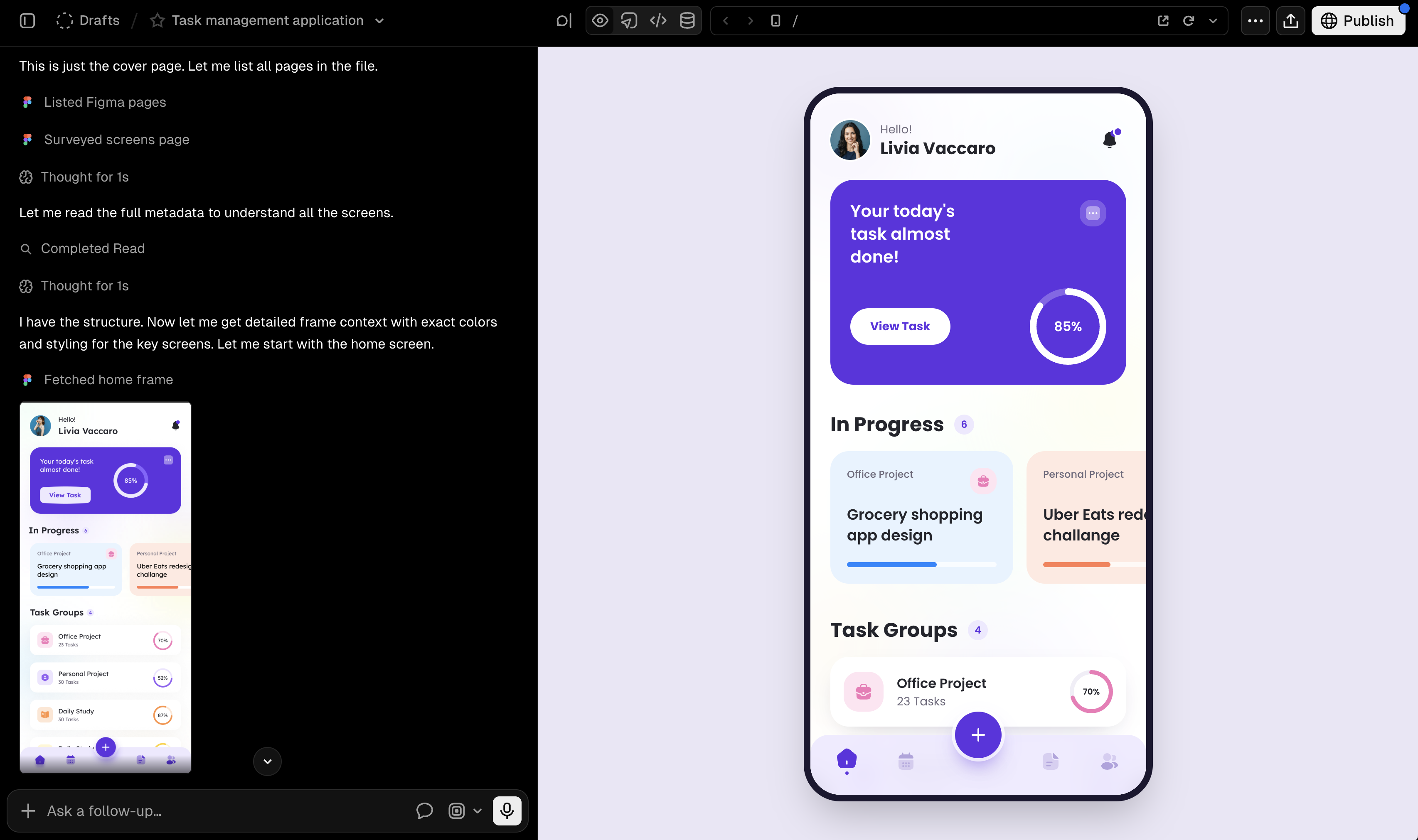
Paste a Figma link into v0 and turn the design into a working app. v0 can read the full file, find the right pages and frames, and build them as one flow. It uses your tokens, layout, text, and assets in the code.
You do not need a plugin or the Figma desktop app.
{/* IMAGE: Show a user pasting a full Figma file link, asking v0 to build the product, and opening the finished multi-screen app in Preview. A short video will show the full flow best. */}
## Build more than one screen
A Figma file can hold every screen and state for a product. Share the file with v0 and tell it which feature or flow to build. v0 finds the right frames, reads each design, and builds the screens as one app.
As v0 works, it shows the Figma frames it reads in the chat. You can check the frames and point v0 to a different page or frame at any time.
## What v0 reads from your file
v0 uses the design data in your Figma file:
* **Pages and frames:** v0 can search the file and choose the screens needed for your request.
* **Frame images:** v0 compares the app with each frame as it builds.
* **Design tokens and colors:** v0 uses the variables and styles set in your file.
* **Layout and text:** v0 reads auto layout, spacing, size, and the exact text in each frame.
* **Assets:** v0 exports icons, logos, and images from the file and uses them in the app.
* **Components and styles:** v0 reads their names and uses them to keep each screen consistent.
* **Dev resources:** v0 can use links added in Dev Mode, such as code, Storybook, docs, or specs.
## Connect your Figma account
The Figma integration is available on paid v0 plans.
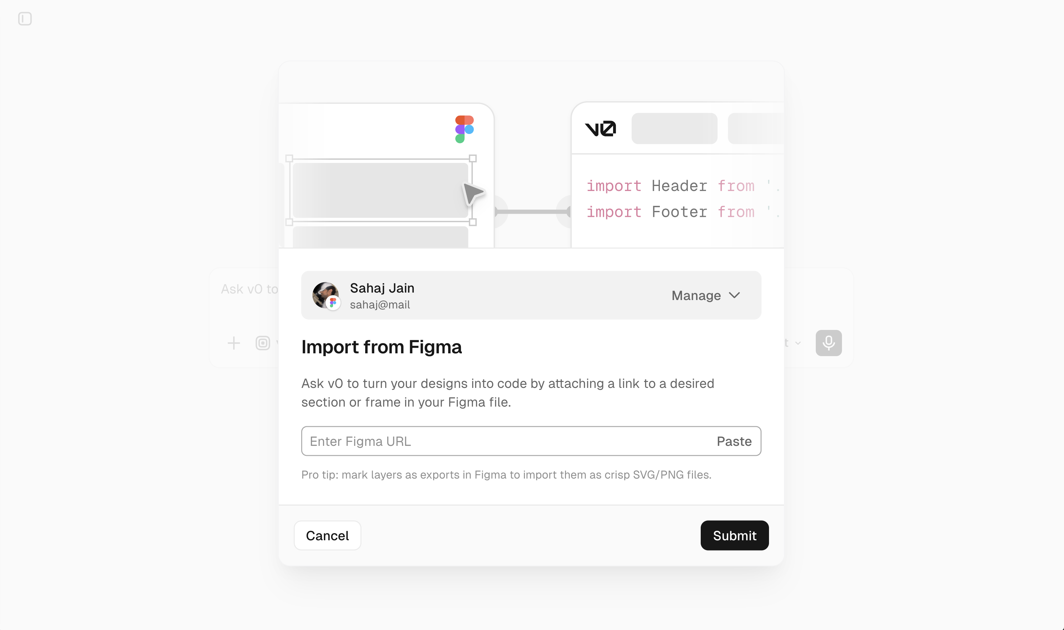
Click the **+** button in the prompt form, choose **Create from Figma**, and sign in with your Figma account. You can also paste a Figma link into the chat. If you have not yet connected Figma, v0 asks you to connect before it reads the file.
Disconnect Figma from **Settings** → **Integrations**, or open **Integrations** in Chat settings.
## Choose which link to share
Share a link to a Figma file or frame.
* **Share a file link** when you want v0 to build several screens or a full flow. Tell v0 which feature, page, or flow you want.
* **Share a frame link** when you want v0 to match one screen or component. In Figma, select the frame, right-click, and choose **Copy link to selection**.
For large files, name the page or section in your prompt. This helps v0 find the right frames with fewer reads.
## Figma rate limits
Figma limits how much data your account can read. Your Figma plan and seat type set the limit. Figma sets these limits, not v0. See [Figma's rate limit documentation](https://developers.figma.com/docs/rest-api/rate-limits/) for details.
If v0 reaches a limit, it tells you and keeps working with the data it has. Wait for the limit to reset before asking v0 to read more from the file. You can also use a Figma plan or seat with a higher limit.
## Get the best results
* Give pages, frames, and components clear names.
* Keep each screen or state in its own frame.
* Use auto layout, components, and design tokens where you can.
* Tell v0 how screens connect when the file does not show it.
* Name the page or flow you want when you share a large file.
* Use a frame link when you need an exact screen or component.
## Troubleshooting
* **Reconnect Figma to continue:** reconnect Figma from **Settings** → **Integrations** or **Chat settings** → **Integrations**, then try again.
* **File not found or access denied:** open the file with the same Figma account that you connected to v0, or ask the file owner for access.
* **v0 chose the wrong frame:** name the page or frame in your prompt, or share a link to that frame.
---
For a semantic overview of all documentation, see [/docs/sitemap.md](/docs/sitemap.md)
For an index of all available documentation, see [/docs/llms.txt](/docs/llms.txt)
For agent-facing discovery, including API and MCP surfaces, see [/docs/agents.md](/docs/agents.md)